
How could a simple software for presenting data have the power to end up killing people?
Many times, high level management from big organizations base their decisions on data presented by employees that utilize tools such as PowerPoint. When it comes to companies that have a high amount of risk involved in its operations, the reliability and trustworthiness of the information presented is of paramount importance. If it’s incorrect, or even if not emphasized enough, it can lead to disastrous events.
Take for example what happened to the Columbia space shuttle. This space shuttle had already completed 27successful missions to the space since 1981, but a fatal communication error leaded to its end in 2003.

In its 28th mission, during the launch, a small piece of foam insulation broke off from the shuttle’s external tank and hit the left wing, damaging the thermal protection system. This system is responsible for protecting the shuttle from the elevated temperatures generated upon reentry to the Earth.
Columbia made it to space and spent sixteen days in there. However, when reentering Earth’s atmosphere, the space shuttle broke apart and resulted in the death of all seven astronauts onboard.
Now, what may seem especially odd is that NASA had more than 2 weeks to prepare Columbia for reentry. Engineers were called to evaluate the situation, and after reading their reports and presentations, top management decided that everything was fine. It turned outit wasn’t.
The employees responsible for assessing the danger of the situation underestimated the danger caused to the space shuttle and reported their conclusions through simple Power Point presentations. This compressed a huge amount of important data and complex engineering assumptions into simple bullet points and graphs.
What is even worse, the way in which information was presented made it look like the damage was not as big as it really was. Edward Tufte, a specialist in information design, talks about how NASA’s PowerPoint presentations can be misleading while handling life-or-death scenarios here.
As an example, while looking at the following slide some problems can be identified:
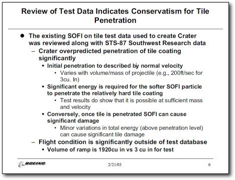
- The bullet point hierarchy makes some statements look more important than others;
- Bold words such as “Overpredicted penetration of tile coating” may make the damage seem less impacting than it really was;
- Below, in smaller and non-bold words, there is the statement that “Test results do show that it is possible at sufficient mass and velocity”, where “it” means catastrophe;
- The last phrase with complicated language “Volume of ramp is 1920cu vs 3 cu in for test” actually means that the foam that hit the space shuttle was 640 times larger than the one utilized for testing.
In the end, their conclusion was simply this: some damage occurred to the space shuttle, but not to the point that it would hinder reentry on Earth. As the information contained in such presentations ascended to higher-level executives in NASA, only the positive information was being biased to be passed on, while the negative points were being filtered out. In the end, the responsible for the decision-making felt relieved, because it seemed that no action was required.
Although this may seem like an extreme example of how misleading information can lead to disasters and death, every organization should be extremely cautious when handling safety information. If there exists any type of risk, they must be clearly stated and defined, and their severity and probability properly assessed. Moreover, the way which such information is presented should be very carefully planned to lead to the right decisions. If this is not correctly done, well, we already know what can happen.